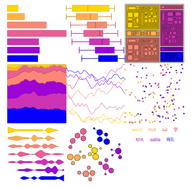
Viz Palette seems like a nifty tool to stress test your color pallet choice for viz options. I will be leveraging this in the future
lets you test your color palette for legibility in different formats, line weights, backgrounds, and font colors. It also shows you what your colors look like to users with different types of color blindness, like deuteranomaly and protanopia. If two colors are too similar, Viz Palette lets you know–and allows you to randomize the sample data to see it with fresh eyes.
